


Abstract
CroP is a data visualization application that focuses on the analysis of relational data that changes over time. While it was specifically designed for addressing the preeminent need to interpret large scale time series from gene expression studies, CroP is prepared to analyze datasets from multiple contexts. Multiple datasets can be uploaded simultaneously and viewed through dynamic visualization models, which are contained within flexible panels that allow users to adapt the workspace to their data. Through clustering and the time curve visualization it is possible to quickly identify groups of data points with similar proprieties or behaviors, as well as temporal patterns across all points, such as periodic waves of expression. Additionally, it integrates a public biomedical database for gene annotation. CroP will be of major interest to biologists who seek to extract relations from complex sets of data.
CroP is freely available for download as an executable jar at https://cdv.dei.uc.pt/crop/.
1 Introduction
Biological datasets are often characterized as complex as they contain large amounts of data points, variables and noise, leading researchers to seek out visualization tools that are able to help in their analysis. While a wide range of biological visualization tools have been developed (Cruz et al., 2018), the analysis of complex biological networks that change over time remains a challenge, as is it necessary to not only discern meaningful relationships, but also identify key behaviors.
CroP is a data visualization application developed in Java using the Processing library, and it offers multiple visualization models within a coordinated multiple views layout. The available visualization models provide different levels of detail on the data, from the characteristics of individual genes to the abstraction of an instance of the dataset onto a point in two-dimensional space. Data can be clustered by position or temporal variance through a hierarchical clustering algorithm, which allows the user to set and quickly switch between the number of clusters (Jain et al., 1999). Through the reactive visualization models and flexible environment, users are provided the means to analyze both the relationships and the behaviors of complex networks over time.
2 Framework
CroP’s interface is divided into an option panel and a workspace (Fig. 1). In the option panel, users can import data files, manage datasets and cluster them based on existing attributes. The workspace consists of a modular environment, where panels containing visualization models are set on a grid-based layout. Through these panels, the user can simultaneously place, interact with and compare between different visualization models, including multiples of the same model to visualize multiple datasets. Each panel can be moved or resized, which will always snap each of its corners to the closet point on the grid (Fig. 2). The grid layout ensures that the organization of the workspace is maintained, while allowing the user to easily place panels directly next to each other and resize windows to identical sizes for consistency. Additionally, overlapping panels are handled automatically, where the overlapped panels are resized, or moved to accommodate the user’s changes. Within the workspace, there are three different visualization models available:
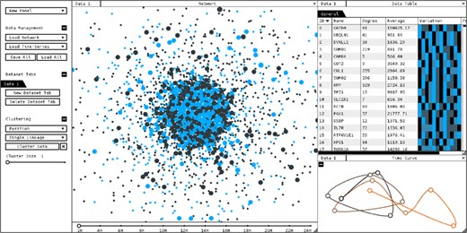
Screenshot of CroP, with network and time-data loaded displayed through a network panel (center), a data table panel (top-right) and a time curve panel (bottom-right)
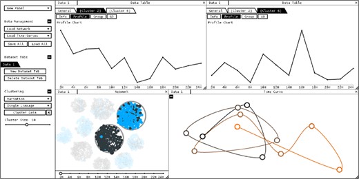
Data has been clustered by variance, and two clusters have been selected. Panel layout has been changed to compare the aggregated profiles of the selected clusters
Network Visualization—Dynamic node-link graph that represents data points and their relationships. Different force-based layouts sort the nodes according to their edges, prevent them from overlapping, and bundle them into groups if the dataset has been clustered. If a time-series dataset has been loaded, this data will be mapped to the nodes’ size and their color will represent the variation of values over time. A timeline will also be added to the bottom of the network panel from which the user can select the current time point.
Time Curve—This model is created by bending a timeline of sequential time points through attraction and repulsion forces, positioning the time points relatively to their similarity. The time curve is capable of representing the general behaviors of an entire network over time, such as significant changes in values, regressions or periodic behaviors (Bach et al., 2016). Temporal progression is represented with color, where black represents the initial time point and orange the last.
Data Table—A scrollable table showing every data point in the currently selected dataset. Columns are updated according to the existing data, and the rows can be ordered by each of the displayed attributes. Clustering the data adds an option to visualize a table of aggregated data for each resulting cluster. Selecting a node or a cluster appends additional options to view details on these, including a temporal profile, edges and Gene Ontology annotations from its integrated dataset.
These three models can be interacted with the mouse, where visualizations can be panned through dragging, and zoomed in or out with the scroll wheel. The user can select one or multiple data points or clusters with the mouse, and these will be highlighted on every network and data table panel that also contains them. Furthermore, there are other coordinated interactions between panels to facilitate navigation, such as the selection of a time point in a time curve also choosing the displayed temporal instance in network panels.
3 Analysis workflow
Through the options panel, the user can import both network and time-series datasets formatted as comma-separated or tab-separated values files, which are scanned in order to warn the user about specific formatting errors. When uploading multiple datasets, these can either be merged within the same data tab or saved into different tabs. In the latter case, datasets can be represented simultaneously through separate panels, allowing them to be compared through juxtaposition.
Regarding relational data, a common issue with the representation of complex networks as graphs is that drawing hundreds of thousands of edges will often result in a visual ‘hairball’ that not only provides practically no perceptible information, but also hides others visual elements. In CroP, the transparency of edges is mapped to amount of edges being drawn, meaning that edges fade out as their number increases until they stop being drawn. If a node is selected, related nodes will be highlighted and only the edges between those nodes will be drawn. Additionally, a list of edges for each node is available in the table visualization. As such, in complex networks, this approach emphasizes the analysis of relationships between elements through relative position. In this respect, nodes are initially positioned according to their relationships using the Yifan Hu layout (Hu, 2005). Clusters are also positioned through attraction forces based on the relationships of the nodes between them, which positions clusters containing related nodes closer to each other.
When handling time-series, CroP focuses on the identification and analysis of the variation of values over time, meaning the periods during which values are increasing or decreasing, as well as the moments when this tendency shifts, known as peaks and valleys. In gene expression time-series data, these shifts represent significant events, as peaks mark the moment when proteins are over-expressed.
In the network panel, the variation of time-series values is represented through size and color, where increases are mapped to brighter colors and decreases are mapped to darker colors. Peaks and valleys are mapped to the brightest blue and pure black respectively to highlight these events. Clustering by variation results in grouping nodes that have similar temporal profiles, including expressing peaks at the same points in time.
The time curve places time points closer based on the percentage of nodes in the network which behave similarly, meaning that the grouped time points will represent instances where the same nodes present the same type of variation, such as increases or peaks. If these time instances are non-sequential, it may represent a cycle, as the network returns to a particular state after a period of time. By pairing the time curve with a clustered network, it is possible to not only identify behavior cycles and their frequency, but also which groups of nodes are repeating which behaviors, such as how often peaks in values occur in each cluster.
For a higher level of detail, data tables present individual time profiles through color and line charts which can be sorted according to similarity. When data is clustered, the user can visualize various proprieties of each cluster, including biological proprieties and aggregated profiles created from average values (Fig. 2).
Funding
This work was funded by the Portuguese Research Agency Fundação para a Ciência e Tecnologia (FCT) (SFRH/BD/124538/2016) and through D4—Deep Drug Discovery and Deployment (CENTRO-01-0145-FEDER-029266).
Conflict of Interest: none declared.
References

