


Abstract
Unbiased clustering methods are needed to analyze growing numbers of complex datasets. Currently available clustering methods often depend on parameters that are set by the user, they lack stability, and are not applicable to small datasets. To overcome these shortcomings we used topological data analysis, an emerging field of mathematics that discerns additional feature and discovers hidden insights on datasets and has a wide application range.
We have developed a topology-based clustering method called Two-Tier Mapper (TTMap) for enhanced analysis of global gene expression datasets. First, TTMap discerns divergent features in the control group, adjusts for them, and identifies outliers. Second, the deviation of each test sample from the control group in a high-dimensional space is computed, and the test samples are clustered using a new Mapper-based topological algorithm at two levels: a global tier and local tiers. All parameters are either carefully chosen or data-driven, avoiding any user-induced bias. The method is stable, different datasets can be combined for analysis, and significant subgroups can be identified. It outperforms current clustering methods in sensitivity and stability on synthetic and biological datasets, in particular when sample sizes are small; outcome is not affected by removal of control samples, by choice of normalization, or by subselection of data. TTMap is readily applicable to complex, highly variable biological samples and holds promise for personalized medicine.
TTMap is supplied as an R package in Bioconductor.
Supplementary data are available at Bioinformatics online.
1 Introduction
Large datasets are generated at an exponentially increasing pace in biology and medicine, while the development of tools to analyze them lags behind. Challenges are posed by the variability of biological, in particular clinical, samples, data acquisition at different times and on different platforms and the necessity to compare measurements at different stages of the life cycle of an individual patient. Statistical methods require large sample numbers to determine the distribution of the data and to extract statistically significant features (Dillies et al., 2013). The choice of normalization can be arbitrary and may affect the outcome of the analysis (Dillies et al., 2013).
Topology is a field of mathematics devoted to the study of shapes. Topological data analysis is used to reduce dimensions and to recognize patterns (Carlsson, 2009; Chazal and Michel, 2017) in datasets as diverse as voting preferences, interactions of basketball players across games (Lum et al., 2013), and classification of nanoporous material (Lee et al., 2017). The clustering method based on algebraic topology, called Mapper (Singh et al., 2007) considers high-dimensional datasets as point clouds and transforms them into networks; the nodes are clusters of samples, which are linked when they contain common samples (Singh et al., 2007). As topology is insensitive to scale and small deformations, it is useful for the analysis of highly variable and noisy data and reveals patterns not detected with standard tools (Cámara, 2016; Chazal and Michel, 2017; Lum et al., 2013). Mapper has been applied to analyze large biological datasets, such as global gene expression profiles of breast cancer samples (Nicolau et al., 2011), temporal single-cell RNA-seq data (Rizvi et al., 2017) and genomic data of viral evolution (Chan et al., 2013). In an approach called Progression Analysis of Disease (PAD) (Nicolau et al., 2011), global gene expression data are processed statistically and subsequently analyzed with Mapper (Cámara, 2016; Chang et al., 2013; De Cecco et al., 2015; Nicolau et al., 2011).
Most clustering methods including k-means (Hartigan and Wong, 1979), hierarchical clustering (Hennig et al., 2015), PAD (Nicolau et al., 2011) and Mapper (Singh et al., 2007) require large sample sizes (Hennig et al., 2015; Osborne and Overbay, 2004; Somorjai et al., 2003) and depend on parameters, which are chosen by the users and may affect the outcome (Von Luxburg, 2010). To ensure that minor perturbations of the dataset do not alter clusters, the methods applied should be stable (Hennig et al., 2015; Von Luxburg, 2010).
To address these challenges, we developed a stable, topology-based method for the analysis of global gene expression profiles called Two-Tier Mapper (TTMap). It combines hierarchical and partitioning clustering and identifies variation and significant relatedness in datasets even when sample numbers are small ().
2 Approach
Each global gene expression profile is represented as a high-dimensional vector in with n the number of genes, features or probes. The input of TTMap is given by two matrices in log-2 scale, one for the control the other for the test samples (Fig. 1a). Batches are defined as groups of samples sharing a source of variation, such as experiment date, technical platform for data acquisition, date or site of sequencing or biological differences, such as mouse strain, patient age or other.
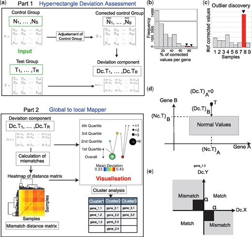
TTMap and its components. (a) Schematic overview of the inputs (green) are given by two gene expression matrices, the control () and the test group () rows represent genes and columns samples. In Part 1, HDA, TTMap adjusts the control group for outlier values () feature by feature. It calculates deviation from this corrected control group for individual samples in the test group (). In Part 2, GtLMap, TTMap computes a similarity measure, the mismatch distance, which is represented as a heatmap, using the deviation components. The Mapper (Singh et al., 2007) algorithm is used with a two-tier cover to generate a visual representation of the clustering creating a network of global clusters (Overall) and local clusters (first, second, third, fourth quartile of a filter function). It takes as inputs the mismatch distance and the deviation components. (b) and (c) Outputs generated using the first part of TTMap: histogram showing the number of features having a certain percentage of outliers (b) and a barplot of the number of outliers per sample in the control group (c) to enable the discovery of highly variable genes or samples (red, arrow). (d) Scheme of a test sample T with its deviation components and normal component from the hyperrectangle (box) of normal values, example for n = 2 genes A and B. (e) Scheme defining a match and a mismatch between two deviations components (Dc) of test samples X and Y with cutoff α to remove noise close to 0 (n = 1). The mismatch distance between two samples is the sum of mismatches through all the genes
TTMap consists of two independent parts: the Hyperrectangle Deviation Assessment (HDA) and the Global-to-Local Mapper (GtLMap) (Fig. 1a). HDA characterizes the control group, and adjusts for outliers to generate the ‘corrected control group’, , which is the reference for calculating the deviation of each individual test vector. GtLMap uses the Mapper algorithm (Singh et al., 2007) with the following parameters: a two-tier cover , the mismatch distance dM, computed from the previously calculated deviations, a closeness parameter ϵ, which is data-driven and a special filter function f, which provides a gradient of proximity to the corrected control group.
Through the filter function the two-tier cover detects global and local similarities in the deviation patterns, allowing it to capture the structure of the test group based on relatedness of samples. The test samples are clustered according to the shape of their deviation. Each cluster is represented by a sphere the size of which reflects the number of samples it contains (Fig. 1a). The extent of deviation of individual clusters from the corrected control group translates into a color-code as well as an arrangement from left to right (Fig. 1a). Subsequent analysis of the commonly changed features in a cluster discerns the differentially expressed genes (Fig. 1a) (details in Supplementary Online methods).
3 Materials and methods
3.1 HDA
HDA compares the value of each feature of each control sample to the values of that feature of all the other control samples in the same batch (Fig. 1a, ‘adjustment of control group’). If the absolute value of the difference between a given value and the median of the values of all the other samples is more than e, the value is considered an outlier and replaced by . The e parameter is computed using the variances of all the genes, to accommodate for the variability of the dataset (Supplementary Online methods). The user can identify highly variable features of the control group by examining the numbers of replaced values for each feature (Fig. 1b). A bar plot showing the number of adjusted values per sample helps identify outliers in the control group (Figs 1c and 4b, Supplementary Figs S1a and S2a).
Here, denotes the value of the expression of gene j in sample i, and is the set of indices of control samples in the batch containing Nk. s are replaced by the median of the normal values in their batch.
Each test sample is decomposed as , where is the normal component, which is its projection onto the hyperrectangle Bk and hence is the closest point to Tk inside Bk (Fig. 1d) and the deviation component, which is the remainder of the projection (Fig. 1d) (Supplementary Online methods).
3.2 GLMap
The second step of TTMap first calculates distances and provides a visualization of these distances and relations in the dataset, in a manner analogous to Mapper (Lum et al., 2013). It forms bins according to a measure of similarity on the test vectors.
For the theory to work and without impinging on the practical results we will consider a slightly modified version of the mismatch distance on our datasets defined by , where is the bounded Euclidean distance by 1/4 (see Supplementary Online methods). If features measured are gene expression values, then the default value does not need to be changed and is set to α = 1, corresponding to a 2-fold-change, which is a standard cutoff for gene expression.
This means that GLMap performs single-linkage clustering with parameter dM, i.e. two samples X and Y are clustered together if and only if there is a list of samples such that for all to
all of , giving the connected components of the graph defined by the vertex set and the edge set and then to
the pre-image with respect to τ of each of the quantiles and , which gives the connected components of the subgraph , where
Two connected components Cij and Ckl are represented as spheres with diameters increasing with the number of samples in each component. The spheres are connected by an edge whenever , i.e. the algorithm links clusters that share samples as every sample is assessed twice for connectivity, once globally and once within its quartile, links are formed between local and global structures, enabling the discovery of subgroups based on the filter function of the global clusters (Fig. 1a, Part 2).
The color of a sphere in the output figure of the method (see example in Section 4.3, Fig. 3b) is determined by the average of the values of the filter function applied to the samples in the bin. A legend for the color-code is provided at the bottom of the output figure, for the size of the balls on the right, and for the different tiers on the left, i.e. the overall clustering and the clustering in the different quartiles (Fig. 1a, Part 2). A list of the differentially expressed genes per cluster is provided.
4 Results
4.1 Theoretical stability assessment
To assess the stability of TTMap theoretically, we studied the effects of modifications of the source space, of the filter function and of approximations with a point cloud on its output (Supplementary Online methods). The absence of a natural distance on the outputs of TTMap precludes direct assessment of the stability of the TTMap graphs. Therefore, we summarized the information contained in the TTMap graphs as a diagram in (Supplementary Fig. S3e), similar to a persistence diagram (PD) (Edelsbrunner and Harer, 2010), where there is a natural distance d that generalizes the distance on PD, enabling a comparison of TTMap graphs. The PDs summarize the topological features of the data such as connected components, holes, branches and dots. We supplemented PDs with links between the ‘local’ features and the connected components or global clusters, forming a descriptor, denoted , for a space X and a filter function that verifies mild regularity conditions. In terms of these enriched PDs, we establish the following theorems, stated informally here and precisely in the Supplementary Online methods in Theorems 1.2, 1.4, 1.5, 1.6, respectively.
Completeness The descriptor is complete: the information contained in the graph of can be recovered from the diagram .
Stability with respect to changes of the filter function If the filter function f is perturbed, the distance between the diagrams of f and of its perturbation is not greater than the amount of perturbation.
Stability with respect to perturbations of the domain If the starting space X is perturbed, then the distance between the diagrams of X and of its perturbation depends linearly on the amount of perturbation.
Stability with respect to point cloud approximations If data points are sampled on a space X, then the difference between the diagrams associated to X and to the δ-neighborhood graph built on the point cloud is less than a value depending on δ.
Thus, the three stability theorems state that the method is stable upon modifications of the source space, of the filter function, and upon approximations with a point cloud.
4.2 In silico validation
As TTMap was conceived for datasets of complex biological and clinical samples with n < 20, we tested its performance using simulated data, in which each sample has features. We used R to generate six control samples, C1–C6, and six test samples; the latter comprised two subgroups TA (TA1, TA2, TA3) and TB (TB1, TB2, TB3) characterized by the same features m deviating from the mean of in opposite directions, see Supplementary Online methods.
First, we assessed the ability of TTMap to correctly identify the two clusters using different numbers of significant features m, namely 50, 100, 1000 and 5000, i.e. 0.5, 1, 10 and 50% of all the features for variance ranging from . Each condition was tested 30 times. When the distance parameter epsilon that is determining when two samples cluster together, is calculated using the probability factor β (see Supplementary Online methods) given by 0.025 corresponding to the lowest 2.5 percentile of the distribution of the distance dM between two random variables, and 1% or more of the features were distinct, TTMap identified the two subgroups with 100% accuracy at variances <0.3 (Fig. 2a), which corresponds to the variance typically observed in biological samples (Klebanov and Yakovlev, 2007). When only 0.5% of the features were distinct, the method failed to distinguish between noise and signal and classified all samples as different for variances between 0.4 and 1.0 (Fig. 2a). When β was chosen equal to 0.975, i.e. the top 2.5 percentile (Fig. 2b), the method performed less well than when β was 0.025 for datasets with 1% or less significant features but improved accuracy for higher variance for datasets with 10% or more significant features (Fig. 2a). Overall, the higher the number of significant features, the better TTMap performed in finding the two subgroups (Fig. 2a and b). Performance also improved when the difference in mean Δ was increased from 2 to 4 (Fig. 2c). When we increased the size of the dataset to 100 control samples and 50 samples in each of the two test subgroups, the accuracy of TTMap increased to 100% accuracy across all variances for datasets with of significant features (Fig. 2d).
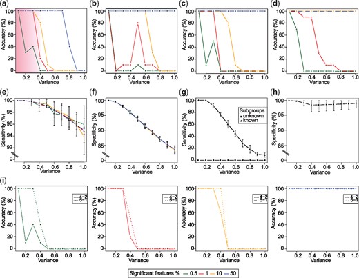
In silico validation of TTMap. (a-d) Plots showing the accuracy of TTMap in identifying two test subgroups in a dataset at variances 0.1–1.0. Pink shade highlights biologically relevant range of variance. Datasets with different percentages of significant features (0.5, 1, 10, 50%) determining the subgroups were tested n = 30 times each. Epsilon was calculated with probability (a) and (b). (c) Plot showing accuracy of TTMap for mean difference of the significant features Δ=4 tested n = 10 times per condition. (d) Plot showing accuracy of TTMap when sample size tested n = 10 times per condition. (e) Plot showing the sensitivity of TTMap i.e. ability to identify true positives at variances 0.1–1.0. Datasets with different percentages of significant features determining the subgroups were tested n = 30 times each. (f) Plot showing the specificity of TTMap i.e. ability to identify true negatives at variances 0.1–1.0. Datasets with different percentages of significant features determining the subgroups were tested n = 30 times each. (g) Plot showing the sensitivity of the moderated-t-test at variances 0.1–1.0. Datasets with different percentages of significant features determining the subgroups were tested n = 30 times each when subgroups are known and unknown. (h) Plot showing the specificity of the moderated-t-test at variances 0.1–1.0. Datasets with different percentages of significant features determining the subgroups were tested n = 30 times each when subgroups are known. (i) Plots showing accuracy of TTMap when the subgroups have different sizes either 4 versus 2 or 5 versus 1 tested n = 10 times per condition. Each panel represents a different percentage of significant features
Next, we evaluated the performance of MClust (Fraley and Raftery, 2002), another clustering method, which, in distinction from most clustering tools, does not need any parameter selection on our in silico dataset. Independent of the percentage of significant features, MClust failed to detect the two clusters (Supplementary Fig. S4). This is in line with MClust relying on data learning which requires large datasets. Moreover, the running time of MClust was 45 times longer than that of TTMap, with 3.8 min versus 5 sec. To assess to what extent the accuracy of TTMap relies on HDA versus GLMap, we applied MClust to the data after HDA, that is using the deviation components. This improved the accuracy of MClust to maximum 30% for datasets with 50% significant features (Supplementary Fig. S4). Thus, HDA improved the accuracy of MClust but it remained accurate for biologically relevant variance.
To assess the ability of TTMap to correctly identify the features that determine a cluster, the true positive rate and the true negative rate, sensitivity and specificity, were computed. In datasets with variance <0.5 sensitivity was close to 100% (Fig. 2e) and specificity was at variances up to 0.4 (Fig. 2f). When a standard statistical method, the moderated-t-test was applied to versus the combined test subgroups, TA and TB, no true positives were identified because the differentially expressed features shared by and deviated in opposite directions from the controls (Fig. 2g). This reflects the problem of hidden subgroups and illustrates a strength of TTMap. When the moderated t-test was applied to each of the two subgroups separately, its specificity was independent of the variance (Fig. 2h), sensitivity was 100% for variance <0.2 independent of the number of significant features. At variance 0.3, sensitivity dropped to and reached at variance 1.0 while it was for TTMap (Fig. 2g). Hence, TTMap outperforms standard statistical approaches with its ability to recognize subgroups and is more sensitive at all variances.
To further challenge TTMap’s ability to identify subgroups, we generated TA and TB of different sizes, i.e. 2 versus 4 and 1 versus 5 samples. Even when one of the subgroups consisted of a single sample only, as could be the case when the dataset has an outlier, accuracy was 100% when of the features were different from the control for variance (Fig. 2i).
4.3 Comparison of TTMap to standard clustering tools on a well-defined biological dataset
To further validate TTMap, we compared it to established clustering methods, k-means (Hartigan and Wong, 1979) and DBSCAN (Ester et al., 1996), on well-characterized biological data using the flyatlas (www.flyatlas.org) with 90-th percentile of the variance equal to 0.0051. This dataset comprises microarray-based RNA expression profiles from 33 different drosophila tissues pooled from 50 male and 50 female flies or third instar feeding or wandering larvae, all in four replicates (Supplementary Table S1). The 132 samples were compared to four replicate samples from ‘whole adult fly’ serving as control group and determined how many organs clustered correctly, i.e. with exactly their four replicates.
For the standard methods parameters were chosen as to maximize their performance; minPts in DBSCAN was set to 4, reflecting the four replicates.
The ϵ parameter of DBSCAN was chosen according to guidelines (Ester et al., 1996). The k in k-means was set to 33, corresponding to the number of distinct tissues. DBSCAN and k-means clustered 20 and 15 tissues, respectively, with their four replicates (Fig. 3a). TTMap, even though not provided with any parameter, clustered 21 tissues uniquely (Fig. 3a). The normalized mutual index score (NMI) with the clustering given by the 33 tissues clustered uniquely with their replicates was 0.95 for DBSCAN, 0.93 for k-means and 0.96 for TTMap.
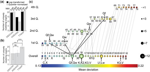
TTMap characterizes deviations of gene expression in different fly organs from whole fly tissues (flyatlas: GSE7763). (a) Barplot representing the number of uniquely clustering organs on log-transformed data and on quantile-normalized data using DBSCAN, k-means and TTMap, with NMI score reflecting the changes to the expected results, i.e. all the profiles of the different organs are in a separate cluster. (b) Barplot representing the number of uniquely clustering organs with random subselection (n = 20) of 50% of the genes on quantile-normalized data using DBSCAN, k-means and TTMap, ***=P-value=0.0001, ****=P-value, ns=not significant. (c) Output of TTMap showing the global clusters (Overall) and local clusters (first, second, third, fourth Q. of the amount of deviation function) with its links to the global clusters. The size of the sphere corresponds to the number of samples in the cluster, the color the average amount of deviation. The number above the sphere identifies the clusters and the letters indicate organs inside a cluster (C: carcass, X: adult trachea, Xf: larvae trachea, Q: fatbody, K: spermatacea virgin, K2: spermatacea mated and K3: spermatacea virgin (redone), V: adult toracic muscle, Qw: fatbody of the wandering larvae, Qf: fatbody of the feeding larvae, Lw: malpighian tubule of the wandering larvae, Lf: malpighian tubule of the feeding larvae, F: whole larvae, T: Testes, B: Brain). Outliers are the adult trachea (X) in clusters 3, 5, the larvae trachea (Xf) in cluster 15, as well as the fatbody (Q) in cluster 10
To compare the changes of the different methods upon normalization, the data were quantile-normalized. The 90-th percentile of the variance was reduced to 0.00494. The NMI between the two clusterings was 0.993 and 0.90, and 0.997 for DBSCAN, k-means and TTMap, respectively (Fig. 3a). However, quantile-normalization increased the number of uniquely clustering tissues to 21 with DBSCAN, to 22 with TTMap and decreased to 10 with k-means (Fig. 3a). Next, we randomly selected 50% of the genes for re-clustering of the quantile-normalized data using the random sample function in R, n = 20. The 90-th percentile of the variance was further reduced to an average of 0.00491. DBSCAN’s performance dropped to an average of 12.6 (NMI = 0.84) with a substantial standard deviation reflecting the difficulty in choosing the epsilon parameter in this case. k-means improved to 13.2 (NMI = 0.90). TTMap significantly increased the number of uniquely clustering tissues to 20 (P-value= 0.0001013 and 6.596e-09 compared to DBSCAN and k-means, respectively) (NMI = 0.99) (Fig. 3b). Thus, TTMap is the most stable method upon normalization and random subselection and detects the maximum number of uniquely clustering organs.
Overall, TTMap formed 32 global clusters (Fig. 3c). The gene expression profiles of whole larvae (F) (Supplementary Table S1) deviated the least (Fig. 3c, cluster 1) and testis (T) and brain (B) the most from the whole adult fly controls as indicated by the color-code as well as their positions from left to right (Fig. 3c, cluster 31 and 32).
Four clusters comprised samples from more than one tissue, while six clusters contained fewer than four replicates, and one cluster comprised four samples not all from the same tissue. The biggest cluster (Fig. 3c, cluster 16) contained the four replicates of virgin (K) and mated spermatacea (K2), as well as three replicates of the spermatacea redone (K3) along with a single replicate of the adult thoracic muscle (V). Interestingly, the fourth replicate of K3 clustered with the three replicates of V, cluster 30, suggesting a labeling mistake, which may explain that standard tools revealed of the genes detected by TTMap (Supplementary Fig. S5a and b). Fat bodies from wandering and feeding larvae (Wq and Fq) clustered together globally (Fig. 3c, cluster 13). Local Mapping using the filter function revealed that three of the four Fq replicates were in the quartile (Fig. 3c, cluster 64), and three Wq samples were in the quartile (Fig. 3c, cluster 36, 43).
This shows that the fat bodies of Wq and Fq share differentially expressed genes, but their expression levels deviate to different extents. This is in line with the fat body having the same role in both developmental states, with an enhanced function when the larvae are constantly feeding compared to when they are wandering. On the other hand, cluster 23 comprises tubules from wandering and feeding larvae (Lw and Lf), which fall into the same quartiles because they not only share the shape of deviation, but also its extent. Interestingly, the heterogeneous cluster 2 comprises four replicates of the adult carcass (C), consisting of everything that is left of the thorax and abdomen after the gut and sexual tracts have been removed, and one replicate of the adult trachea (X). These tissues are anatomically close and technically difficult to dissect, hence cross contamination is a likely problem. In line with this hypothesis, the other trachea replicates were in nearby groups 3 and 5. An outlier from the fat body (Q) was identified as cluster 10, while the three other replicates clustered together much further away in terms of amount of deviation in cluster 20. An identical situation was noted for the larval trachea (Xf) found in cluster 15 and 19 (Fig. 3c). Thus, the two-part clustering of TTMap adds information and provides additional biological insights.
4.4 TTMap and subtle gene expression changes
We challenged TTMap by asking it to identify subtle gene expression changes as they occur in a complex organ related to cyclic alterations in hormone levels. For this, we studied RNA-seq data from intact mammary glands from C57BL/6 and BALB/c females, collected in different phases of the estrous cycle—proestrous (P), estrous (E) and diestrous (D)—based on the prevalence of different cell types in their vaginal smears (n = 12) (Snijders et al., 2014) (Fig. 4a) with 90-th percentile of variance =0.18.
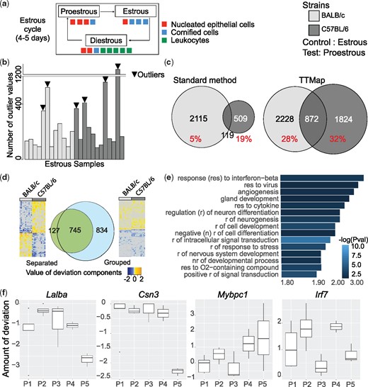
Estrous cycle related gene expression changes in the mammary glands of C57BL/6 and BALB/c mice; estrous versus proestrous phase. (a) Scheme of murine estrous cycle. The estrous cycle is divided into Proestrous (P) followed by Estrous (E) and then by Diestrous (D) phase, determined according to the prevalence of different cell types, nucleated epithelial cells, cornified cells, leukocytes, in the vaginal smear. (b) Barplot representing the number of outlier values in each of sample of the control group (estrous phase). Samples with high number of outlier values and remain isolated during clustering when E is the test group are identified as outliers (arrowheads). (c) Venn diagrams of the genes differentially expressed between E versus P using standard analysis tools and TTMap on BALB/c compared to C57BL/6 analyzed separately. In red, the fraction of common significant genes per strain (% over total number of significant genes). (d) Venn diagrams of the common differentially expressed genes when the analysis is done separately on the two mouse strains (Separated) or with the two mouse strains combined into one analysis (Grouped) using TTMap comparing E versus P. Adjacent heatmaps of the deviation components illustrate the reason why the genes were missed; while on the separated analysis deviations are going into opposite direction, in the grouped analysis the genes deviate in the same direction, but to different extent. (e) Panther pathway analysis (Mi et al., 2017) of significant genes identified by TTMap in the comparison E versus P shown by FC enrichment of the pathway with -log(Pval) as a color-code. Fifteen most increased pathways are shown. (f) Boxplots representing the deviation component values in the identified subgroups of P (P1, P2, P3, P4, P5) by TTMap ordered by amount of deviation compared to the estrous samples (controls) of the genes Lalba, Csn3, Mybpc1 and Irf7. Points outside the box depict extreme values, upper and lower borders of the box represent lower and upper quartiles, and line inside the box identifies the median
Principal component analysis grouped samples according to strain (Supplementary Fig. S6a); and standard analysis was performed on each strain separately (Snijders et al., 2014) leading to the identification of differentially expressed genes with a false discovery rate < 0.05 and a low fold change (FC) of (Snijders et al., 2014).
We considered each of the three cycle phases as the control group in TTMap and set TTMap’s α parameter lower to to be comparable (Fig. 4c, Supplementary Figs S1b and S2b). The number of outliers was 6/24 for estrous (E) (Fig. 4b, arrowheads), 4/23 for diestrous (D) and 4/23 for proestrous (P) (Supplementary Figs S1a and S2a). TTMap increased the number of significant genes by a factor of 1.38 in the comparison E versus P in BALB/c and 4.29 in C57BL/6 (Fig. 4c). Moreover, a 1.08 and 5.29-fold increase in the number of significant genes in D versus P and E versus D, respectively, was observed in BALB/c, and a 2.2 and 2.83-fold increase in C57BL/6 in these two comparisons, respectively (Supplementary Figs S1b and S2b). The overlap of significant genes between the two strains changed with TTMap compared to the standard analysis (Snijders et al., 2014). For E versus P, a consistent increase from 5 to 28% in BALB/c and 19 to 32% in C57BL/6 was observed (Fig. 4c). For D versus P, it increased from 18 to 36% in BALB/c and decreased from 47 to 45% in C57BL/6 (Supplementary Fig. S1b). In E versus D, an increase from 0 to 20% was found for both strains (Supplementary Fig. S2b).
Next, TTMap considered a strain as a batch (Fig. 4d). This grouped comparison increased the number of common genes 1.81-fold (Fig. 4d, Venn diagram) for E versus P and 1.72- and 2.23-fold for D versus P and E versus D, respectively (Supplementary Figs S1c and S2c) over the common genes from the separate analyses with TTMap. The significant genes comprised> 85% of the genes identified by separate analysis (Fig. 4d, Venn diagram).
Heatmaps of the deviation components showed that the genes missed by the grouped analysis were differentially expressed in different phases of the cycle in BALB/c and in C57BL/6 mice but in opposite directions (Fig. 4d, Supplementary Figs S1c and S2c, heatmaps on the left), whereas genes missed by separate analysis deviated in the same direction from the control in both strains but did so to different extents and had therefore failed to reach significance in one of the strains (Fig. 4d, Supplementary Figs S1c and S2c, heatmaps on the right).
Bioinformatic analysis of the genes revealed by grouped analysis of E versus P using pathway analysis (Mi et al., 2017) revealed ‘angiogenesis’ (FC = 2.81, ) and ‘gland development’ (FC = 2.44, ) as important terms (Fig. 4e) missed with standard tools, and ‘positive regulation of tumour necrosis factor (TNF) superfamily cytokine production’ (FC = 4.26, ) in D versus P (Supplementary Fig. S1d) when TNFα expression was shown to change through the human menstrual cycle (Amory et al., 2004). Genes in E versus D were related to immune and inflammatory responses terms (Supplementary Fig. S2d).
Using the filter function to determine the extent of deviation from the control group, TTMap orders subgroups within each phase. For P, P1 is closest and P5 furthest from the control (E) (Supplementary Fig. S6b). Among the significant genes in these subgroups are genes whose expression was previously shown to vary through the human menstrual cycle (HuJun et al., 2014; Pardo et al., 2014) (Fig. 4f, Supplementary Figs S1e and S2e), such as Mybpc1, a progesterone target gene (HuJun et al., 2014), and the milk protein coding genes Lalba, Csn3, all missed with standard tools. These genes deviate significantly only in subgroups of P (Fig. 4f). In contrast, the normalized expression levels of Irf7, a gene detected by standard tools, were at least 1.2-fold higher in all 5P subgroups, as reflected by the deviation components, compared to E (Fig. 4f). Biologically, estrous cycle phases are continuous rather than discrete subgroups (Fig. 4a), TTMap maps samples in-between two phases by providing information about the overall closeness to control, as in the case of P1.
This was further validated by KEGG and Panther pathway analysis of the genes that are differentially expressed between these phases; we discovered that P1, even though already having downregulated pathways that are common to the five proestrous subgroups, such as Fatty acid metabolism, P = 0.0025, it had not yet upregulated major pathways like the oxytocin and calcium signaling pathway. Moreover, fluctuations in hormone signaling are reflected in P4 which revealed GO molecular pathways such as ‘response to hormone’ (P = 0.0144), ‘lactation’ (P = 0.0152), ‘response to steroid hormone’ (P = 0.0179), ‘cellular response to hormone stimulus’ (P = 0.0186) and ‘response to progesterone’ (P = 0.0186).
Thus, TTMap reflects the underlying cyclic biology better than the standard tools and provides more information and additional insights into estrous-cycle-related gene expression changes.
5 Discussion
We have developed a topology-based clustering method, TTMap, that outperforms existing clustering tools, with particular strength for small sample numbers. Thanks to the two-tier cover, the algorithm is theoretically stable, as expressed precisely in three stability theorems. The two-tier cover not only provides the global clusters in an unbiased manner, but provides additional local information using a filter function that yields deeper insights into the composition of the clusters. Having a control group enabled us to define a new topological type of distance on the samples leading to an enhanced view on the data.
TTMap does justice to biological complexity and detects significant subgroups within a cluster. The clustering of data from different platforms or batches reflected the existence of samples that are in between two phases, and revealed subgroups that reflect possible alterations of hormone levels. For example, TTMap discovered subgroups that have differentially expressed genes, known to vary along the human menstrual cycle (Pardo , 2014) or are under control of progesterone (HuJun et al., 2014). These subgroups are invisible to standard tools, since these genes are significantly expressed only in certain subphases of the estrous cycle.
Existing Mapper applications require that sample sizes are large and that multiple parameters are selected by the user, the choice of which is problem-dependent (Cámara, 2016; Chan et al., 2013; Nicolau et al., 2011; Nielson et al., 2015; Rizvi et al., 2017). Our improved and extended version of Mapper is user-independent because it has an optimized parameter selection and it performs well independently of sample sizes. The method is available as a freely downloadable library ‘TTMap’ in Bioconductor, enabling widespread application of this useful tool.
As implemented here, the filter function takes into account only one specific aspect of refinement. To further enhance the method, one can filter by any metadata, such as categorical information and numerical data. This flexibility enables the user also to interrogate the data in various ways. All outputs can be compared, as the global clusters are independent of the filter function chosen.
TTMap produces individual profiles of deviation from the control for each sample and relates it to other samples. This, together with its ability to account for batch effects, make it a promising tool for personalized medicine, where increasingly complex individual patient data need to be analyzed and related to other samples.
Acknowledgements
The autors thank Valentina Scabia for critical reading of the manuscript, Evarist Planet and Julien Duc for the help with R package development and for valuable feedback. The in silico computations were performed at the Vital-IT (http://www.vital-it.ch) Center for high-performance computing of the SIB Swiss Institute of Bioinformatics.
Funding
This work was supported by Swiss National Founds [SNF 31003A_162550/1 Hormonal and cell signaling control of mammary gland morphogenesis: the role of Adamts18 in epithelial-basal membrane interactions that control the stem cell function downstream of progesterone receptor signaling to C.B.]; and by European Research Council grant Gudhi [ERC-2013-ADG-339025 to S.O.].
Conflict of Interest: none declared.
References

