


Abstract
High-dimensional mass cytometry (CyTOF) allows the simultaneous measurement of multiple cellular markers at single-cell level, providing a comprehensive view of cell compositions. However, the power of CyTOF to explore the full heterogeneity of a biological sample at the single-cell level is currently limited by the number of markers measured simultaneously on a single panel.
To extend the number of markers per cell, we propose an in silico method to integrate CyTOF datasets measured using multiple panels that share a set of markers. Additionally, we present an approach to select the most informative markers from an existing CyTOF dataset to be used as a shared marker set between panels. We demonstrate the feasibility of our methods by evaluating the quality of clustering and neighborhood preservation of the integrated dataset, on two public CyTOF datasets. We illustrate that by computationally extending the number of markers we can further untangle the heterogeneity of mass cytometry data, including rare cell-population detection.
Implementation is available on GitHub (https://github.com/tabdelaal/CyTOFmerge).
Supplementary data are available at Bioinformatics online.
1 Introduction
High-dimensional mass cytometry by time-of-flight (CyTOF) (Bandura et al., 2009) allows the simultaneous measurement of over 40 protein cellular markers (Spitzer and Nolan, 2016). Several studies have illustrated the value of using such a large number of markers to provide a system-wide view of cellular phenotypes at the single-cell level (Amir et al., 2013; Chevrier et al., 2017; Lavin et al., 2017, 2015; Newell et al., 2012, 2013; van Unen et al., 2016; Wong et al., 2016).
Despite the 3-fold extension in the set of markers profiled with CyTOF compared to flow cytometry (FC), technical challenges in designing CyTOF panels limit the number of markers profiled per panel currently to about 40 markers (Bendall et al., 2012). In many cases, the number of proteins required to describe the heterogeneity of cells far exceeds the number of markers that can be measured using a single CyTOF panel (Bendall et al., 2011; Chevrier et al., 2017). To overcome the limitation in the number of markers that can be measured simultaneously, a sample can be split into multiple tubes which are subsequently measured using different CyTOF marker panels (Lee et al., 2011; O’Neill et al., 2015; Pedreira et al., 2008). Including a shared marker set between all panels allows the combination of measurements from all panels to produce an extended marker vector for each cell. However, there are currently no computational methods available to integrate measurements from multiple CyTOF panels.
An implicit combination approach, proposed by Bendall et al. (2011), allowed the visualization of 49 markers, measured using two CyTOF panels sharing 13 markers. After clustering cells from one panel based on the set of shared markers, they overlaid the unique markers of the second panel over the obtained clusters according to the similarity between cells based on the shared markers set. This approach, however, does not explicitly merge the measurements from both panels since the clustering step is performed only on cells from one panel using the shared markers. Therefore, this approach is prone to misidentify small subpopulations of cells (as we will show later in Section 3.4).
In the field of FC, two approaches have been proposed to integrate measurements from multiple FC datasets. A nearest-neighbor algorithm was used to integrate measurements from multiple FC panels assuming that each cell is almost identical to its nearest-neighbor cell, measured with a different panel, based on the overlapping markers, which we denote as the first-nearest-neighbor imputation (Costa et al., 2010; Pedreira et al., 2008; van Dongen et al., 2012). However, the first-nearest-neighbor approach is noise-sensitive and can produce false combinations between cells from different panels resulting in artificial clusters (O’Neill et al., 2015). Lee et al. (2011) proposed to overcome this limitation by incorporating a clustering step based on the shared markers before merging the FC measured panels, followed by enforcing the imputation of the missing markers from the same cluster, which we refer to as cluster-based imputation. However, the larger number of unique markers per panel in the case of CyTOF, compared to FC, can result in a large number of undiscovered clusters if cells are clustered only using the set of shared markers (as we will show later in Section 3.2). An alternative approach is to divide the space of shared markers in each panel by binning biaxial scatter plots of marker pairs, each having a preset number of cells. Bins are then matched across the measured panels, and the missing markers are imputed per bin (O’Neill et al., 2015). Although feasible for FC data, applying this method to CyTOF data, which has many more possible shared markers and many more cells, is computationally prohibitive. Moreover, the imputation strongly depends on the binning and matching step in a complex high-dimensional space.
We propose a method, CyTOFmerge, that does not depend on a priori clustering or partitioning and extends measurements per cell. Our CyTOF data merging approach is based on the k-nearest-neighbor algorithm which avoids the noise sensitivity problem by relying on a relatively large number of neighbors. In addition, we propose a method to select the most informative markers from one CyTOF panel, in order to be used as shared markers with other panels. This is particularly important given that the imputation strongly depends on the set of shared markers. By merging measurements from multiple CyTOF panels, we increase the number of markers per cell allowing for a deeper interrogation of cellular composition.
2 Materials and methods
2.1 Approach
Given that the maximum number of markers on a single CyTOF panel is N, the goal of our study is to integrate measurements from two CyTOF panels, panels A and B, given that both panels share at least m < N markers. The remaining slots (N−m) on each panel can be used to measure markers that are unique to each panel. Both panels A and B measure parts of the same sample. Relying on the similarities between cells in both panels based on the shared marker set m, we can impute markers that were not measured on panel A using the measurements from panel B, and vice versa. The resulting merged dataset extends the number of markers per cell to 2N−m, on which clustering and cell populations identification can be applied (Fig. 1). We defined a cell population as group of cells having similar protein marker expression, these cells can represent either cells with the same type and/or state, according to which protein markers are used (Wagner et al., 2016).
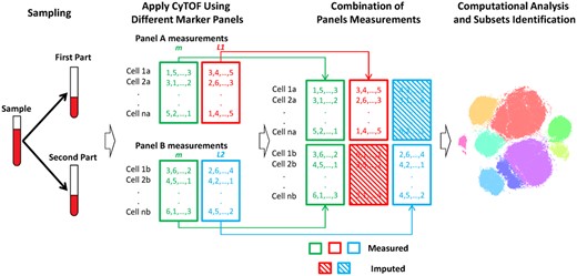
CyTOFmerge pipeline: split the sample, stain each partial sample with a different marker panel and apply CyTOF to obtain the panels’ measurements. Both panels A and B share a set of markers m (green). L1 (red) are unique markers of panel A, and L2 (blue) are unique markers of panel B. Both panel measurements are combined to obtain an extended markers measurements per cell, which is input to downstream computational analysis as, e.g. clustering in a t-SNE mapped domain shown here
A major challenge in this approach is to determine the shared markers (m), i.e. which markers can preserve the heterogeneity of cell populations. To address this problem, we propose a data-driven approach (Supplementary Fig. S1). Briefly, for each value of m, we use a dimensionality reduction technique to select the best set of markers preserving the high-dimensional structure of the data. By simulating the scenario shown in Figure 1, the quality of an imputation is evaluated using several quantitative scores capturing clustering and neighborhood preservation, from which the minimum number of shared markers can be deduced. Full details of the selection process are described in Section 2.6.
2.2 CyTOF datasets
In this study, we applied our methods to the publicly available HMIS and Vortex datasets. The HMIS dataset profiled the human mucosal immune system by measuring Peripheral Blood Mononuclear Cells (PBMCs) and intestine tissue samples from the duodenum, rectum and fistula (van Unen et al., 2016). Using a CyTOF panel with N = 28 surface protein markers, a total of ∼5.2 million cells positively expressing CD45 (immune cell marker) were analyzed (3.6 million PBMCs and 1.6 million intestine tissue cells), which they down sampled to ∼1.1 million cells, randomly distributed over all PBMC and tissue cells. The marker panel included lineage markers used to differentiate between major types of immune cells, and non-lineage markers used to distinguish between different subgroups (states) of cells within each lineage. Cells were globally clustered into six main lineages: B cells (∼93 000), CD4+T cells (∼230 000), CD8+T cells (∼460 000), CD3-CD7+Innate lymphoid cells (ILCs) (∼95 000), Myeloid cells (∼117 000) and TCRγδ cells (∼88 000). Each lineage was subsequently clustered independently, resulting in 119 subgroups across all six lineages, including small clusters representing rare cell populations.
The Vortex dataset is a publicly available mass cytometry data for 10 replicates of mice bone marrow cells (Samusik et al., 2016). A total of ∼840 000 cells were measured using a CyTOF panel of N = 39 markers. Three cytometry experts provided a consensus clustering of 24 clusters for only ∼510 000 cells. Prior to any processing, measured marker expressions were transformed using hyperbolic arcsin with a cofactor of 5 for both datasets.
2.3 Simulating two overlapping panels
We simulated the scenario of having two overlapping panels by splitting the original dataset (Do) into two datasets, DA and DB, each measured using a different (simulated) CyTOF panel (Supplementary Fig. S1). Both panels share m markers, and the remaining N−m markers from the original panel were randomly divided between the two simulated panels. The first simulated panel (A) contains m+L1 markers, whereas the second panel (B) contains m+L2 markers, where L1+L2 = N−m. Each of the two panels measures half the number of cells in the original dataset (randomly chosen without replacement), i.e. the panels measure non-overlapping cells from the original dataset.
2.4 Data imputation
Data in both simulated CyTOF panels is imputed using the k-nearest-neighbor algorithm. For each cell measured by panel A, we find the k-most-similar cells measured by panel B using the m shared markers. Then, for each cell measured by panel A, the values of the missing markers (L2) are imputed by taking the median values of those markers from the k-most-similar cells measured by panel B, resulting in imputed dataset . The same procedure is used to impute the values of the missing markers L1 from panel A to cells measured with panel B, resulting in imputed dataset . The original dataset is reconstructed () by concatenating the two imputed datasets ( and ), and thus has the same number of cells and the same number of markers N as the original dataset, albeit partly imputed (Fig. 1 and Supplementary Fig. S1).
2.5 Selection of m shared markers
Given a dataset with a panel of N markers, we follow three steps to choose the m shared markers that can be used to design follow up panels for a deeper interrogation of cells (Supplementary Fig. S1):
Removing correlated makers. Pearson correlation over all cells in the original dataset between each pair of markers is calculated. If the absolute value of the correlation of two markers is larger than a specified cutoff (here we use 0.7 and 0.8 as cutoffs, for the HMIS and Vortex datasets, respectively), we remove the marker which has the lower variance across all cells.
Dimensionality reduction. To reduce the number of markers we exploited three different dimension reduction techniques: (i) principal component analysis (PCA); (ii) Auto Encoder (AE) and (iii) Hierarchical Stochastic Neighboring Embedding (HSNE).
An AE neural network (Hinton and Salakhutdinov, 2006) with one hidden layer containing m nodes is trained for a maximum of 50 iterations (using the Matlab toolbox for Dimensionality Reduction, drtoolbox: https://lvdmaaten.github.io/drtoolbox/) until the output of the trained AE is similar (mean squared error <0.75 for all values of m) to the original input data. We then calculate the variance of all AE output markers, sort them and select the m markers with the highest variance.
Using HSNE (Pezzotti et al., 2016; Van Unen et al., 2017), we project the cells using five hierarchical layers. We represent the dataset using only the landmark cells in the top layer. On these landmark cells we apply the PCA-based reduction scheme to select the m markers.
Selecting m out of the original N markers. Using one of the dimension reduction schemes, we select the top-m markers to be used as shared markers. Based on the simulated datasets, we impute the missing markers in each dataset, which we compare to the original dataset using three quantitative scores introduced in the following section. By evaluating those scores over varying values for m, we make a choice for the most suitable value of m.
2.6 Comparing two datasets
To evaluate the quality of the imputed dataset () compared to the original dataset (), we use three different scores: (i) how well the clustering is preserved (cluster score); (ii) how close the same cells in the different datasets are to each other (distance score) and (iii) how well the neighborhood of each cell is preserved (nearest-neighbor score). These scores are defined as follows:
2.7 Finding clusters
We clustered both datasets, HMIS and Vortex, with Phenograph, a neighborhood graph-based clustering tool designed for automated analysis of mass cytometry data (Levine et al., 2015a). Phenograph is applied to the original and imputed datasets, using the R implementation with default settings (number of neighbors =30).
More fine-grained cluster annotations for the HMIS datasets are acquired using Cytosplore (www.cytosplore.org), a tool specifically designed for the analysis of mass cytometry data (Höllt et al., 2016; Van Unen et al., 2017). Briefly, cells are embedded into a 2D map using t-Distributed Stochastic Neighbor Embedding (t-SNE) (Pezzotti et al., 2017; van der Maaten and Hinton, 2008), and subsequently clustered using a density-based Gaussian Mean Shift algorithm (Comaniciu and Meer, 2002) using a relatively small density kernel (σ = 20–23), resulting in over-clustering of the data. Clusters are then manually merged when they have highly similar marker expression profiles (median value of each marker per cluster).
3 Results
3.1 Selecting the set of shared markers
To determine the shared markers that can be used to combine two CyTOF datasets, we simulated the scenario of having two overlapping panels with different sets of shared markers m, on which we applied our data imputation approach with different number of neighbors k (Supplementary Fig. S1). We investigated how the imputation of the two panels is influenced by: (i) the dimension reduction technique used to select the shared markers, (ii) the data (lineages) used to select the markers, (iii) the number of shared markers (m) and (iv) the number of nearest neighbors used during imputation (k).
In the HMIS dataset, the method used to select the shared markers has limited influence on the results. Figure 2 shows which markers are selected by the different marker selection schemes (PCA, AE and HSNE) when changing the number of selected shared markers (m) from 4 to 25 and applied on the 5.2 million cells. In the preprocessing step, CD8b and CD11b were removed from the selection as they are highly correlated with CD8a and CD11c (correlation of 0.843 and 0.705, respectively), leaving 26 markers to choose from. There are small differences in the selection profiles between the three methods, with a maximum of two mismatches. For 14 < m < 17, the same set of shared markers is selected by all three methods. In terms of computation time, PCA outperforms the AE and the HSNE (100× and 480×, faster on the same machine, respectively).
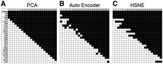
Shared markers for the HMIS dataset. The selected markers that can best represent the dataset using (A) PCA, (B) AE and (C) HSNE (marker ordering is based on the PCA selection profile, black is selected, white is not selected)
We checked whether the marker selection procedure is influenced by the type of cells. Therefore, we applied the PCA-based marker selection on PBMCs and tissue cells independently. Supplementary Figure S2 shows that there is little difference in the selected set of markers when using the PBMC, tissue or PBMC+tissue samples.
Next, we assessed the quality of the subsequent imputed dataset for each lineage individually, as well as all six lineages together, for m = 4–25 and k = 50. For all three evaluation scores, the performances improve when the number of shared markers increases (Supplementary Fig. S3A–C). All performance scores seem to saturate at m = 16 (Supplementary Fig. S4A–F), i.e. they exceed 80% of the maximal score. Table 1 shows the values of the three quality measures at m = 16, for each individual lineage and the six lineages together.
Evaluation scores for the 16 selected shared markers for the 1.1 million cells HMIS dataset
| Approximate cluster score (%) | Distance score (%) | Nearest neighbor score (%) | |
|---|---|---|---|
| CD4+T cells | 92.3 | 84.3 | 94.5 |
| CD8+T cells | 91.9 | 83.9 | 93.1 |
| B cells | 91.8 | 82.0 | 92.8 |
| CD3–CD7+cells | 89.3 | 83.4 | 92.6 |
| TCRγδ cells | 86.2 | 84.1 | 94.7 |
| Myeloid cells | 86.2 | 80.4 | 82.5 |
| All cells | 89.4 | 87.4 | 91.9 |
A common measure to assess the quality of imputation is to investigate the correlation between the original and imputed values. However, this approach turned out not to be appropriate for our data since many markers are being expressed only in a specific population of cells. As a result, the correlation is relatively high for markers that are high expressed over multiple cell populations (Supplementary Figs S5 and S6), but the correlation is low for cell-population specific markers (such as, e.g. the CD123 marker which is high expressed only in the CD4+T cells lineage). These cell-population specific markers are imputed correctly (low values for most cells and higher values for the cell-population specific cells), but the noise on the abundant low values dominates, causing a low correlation. Consequently, we decided not to use the correlation as a quantitative score to evaluate how well an imputed dataset resembles an original dataset.
We further investigated the distribution of the non-shared (imputed) marker by comparing the distributions of the original values with those of the imputed values for each non-shared marker per cell population, and quantify the similarity using the JSD (Section 2.6). Across all the 12 non-shared markers, we obtained low JSD values (<0.2) showing a high similarity between the original and imputed values (Supplementary Fig. S7A). The imputation process does exclude the outlier values, as we use the median value from the 50 most similar cells, which results for some markers, in ‘compressed’ distributions as compared to the original ones (Supplementary Fig. S7B and C).
Next, we investigated the effect of the choice of the number of neighbors (k) used when applying the k-nearest-neighbor imputation. Supplementary Figure S4A–F shows the approximate cluster score for k = {1, 10, 50, 100, 200, 250, 300, 500, 1000}, with k = 50 clearly showing the highest performance across all lineages, even over different numbers of shared markers.
We observed similar results when applying all these analyses to the Vortex dataset: (i) small differences between PCA, AE and HSNE when m is ranging from 4 to 38 (Supplementary Fig. S8), (ii) improving and saturating performance scores with increasing number of shared markers (Supplementary Fig. S3D) and (iii) highest performance when k = 50 is used during imputation (Supplementary Fig. S4G). The saturation for the number of shared markers occurs at m = 11, with the approximate cluster score, distance score and nearest-neighbor score being 95.3, 84.0 and 82.1%, respectively.
3.2 CyTOFmerge reproduces original cell populations and outperforms FC imputation methods
To demonstrate the feasibility of our computational method to combine data measured from multiple CyTOF panels, we investigated the quality of the clustering of the imputed dataset. First, the original 1.1 million cells HMIS dataset was clustered on the full marker space using Phenograph, resulting in 52 clusters of cells divided into: 6 B cell populations, 8 CD4+T cell populations, 15 CD8+T cell populations, 6 CD3-CD7+ ILC populations, 7 Myeloid populations, 5 TCRγδ cell populations and 5 unknown populations donated as Others (Supplementary Fig. S9). These 52 clusters are used as a baseline for comparison with the imputed datasets.
We applied the panel combination and imputation method using k = 50 and m = 16, thus imputing 12 markers (6 unique markers for panel A, and 6 unique markers for panel B). The imputed dataset was clustered on the full marker space using Phenograph, resulting (coincidentally) in 52 clusters with slight variation in the number of clusters per cell lineage (Supplementary Fig. S10A). To evaluate the imputation, we matched the imputed clusters to the original clusters using the maximum pairwise Jaccard index. The cluster matching shows that all imputed clusters match to original clusters within the same lineage (Supplementary Fig. S10B). Next, we calculated the adjusted Rand-index representing how similar both clusterings are (Table 2).
Comparison between CyTOFmerge and FC merging methods on the 1.1 million cells HMIS dataset
| Adjusted Rand-index | Distance score | Nearest neighbor score | |
|---|---|---|---|
| CyTOFmerge | — | — | — |
| HMIS, m= 16, k=50 | 0.81 | 87.4% | 91.9% |
| Vortex, m=11, k=50 | 0.90 | 84.0% | 82.1% |
| First-nearest-neighbor | — | — | — |
| HMIS, m=16, k=1 | 0.77 | 83.5% | 75.6% |
| Vortex, m=11, k=1 | 0.93 | 77.9% | 51.6% |
| Shared markers clusters | — | — | — |
| HMIS, m=16 | 0.68 | n.a | n.a |
| Vortex, m=11 | 0.79 | n.a | n.a |
| Cluster-based imputation | — | — | — |
| HMIS, m=16, k=50 | 0.80 | 87.4% | 91.8% |
| Vortex, m=11, k=50 | 0.84 | 84.0% | 82.1% |
n.a=not applicable.
To compare with the first-nearest-neighbor approach proposed by (Pedreira et al., 2008), we applied the imputation method using k = 1, using the same set of 16 shared markers. Phenograph clustering of that imputed dataset on the full marker space resulted into 53 clusters (Supplementary Fig. S11) with a lower performance compared to CyTOFmerge using k = 50 (Table 2).
Next, we compared the performance of CyTOFmerge to that of the cluster-based imputation method proposed by Lee et al. (2011). In this approach, clusters are first determined using the shared markers followed by imputation of the unique markers in each panel within the same cluster. We clustered the cells using the 16 shared markers for the entire dataset using Phenograph and obtained 42 cell clusters, 10 clusters less than the original dataset clustering (Supplementary Fig. S12). When comparing with the original clustering (Table 2), we observed a relatively large drop in the adjusted Rand-index. Hence, clustering based on the shared markers only could not identify a large part of the original clustering using all markers. However, when we performed the combination of the two panels using the cluster-based imputation, we obtained comparable performance with CyTOFmerge (Supplementary Fig. S13, Table 2).
We also tested CyTOFmerge on the Vortex dataset, using m = 11 shared markers and k = 50, now imputing 28 markers (14 unique per panel). Phenograph clustering of the original dataset gave 31 clusters (Supplementary Fig. S14), while clustering the imputed dataset resulted in 28 clusters (Supplementary Fig. S15). The adjusted Rand-index was relatively high, i.e. 0.90 (Table 2). Next, we applied first-nearest-neighbor approach, and we clustered the resulting imputed dataset resulting in 29 clusters. The first-nearest-neighbor has slightly higher adjusted Rand-index compared to CyTOFmerge, however, we observed a large drop in the distance and the nearest-neighbor scores (Table 2). Moreover, confirming our previous observation, the clustering of the shared markers only produces 23 clusters, 8 clusters less than the original dataset clusters, with a relatively large drop in the adjusted Rand-index when compared to the original clustering. Finally, the cluster-based imputation method produces 29 clusters. Compared to CyTOFmerge, the cluster-based imputation method shows comparable distance and nearest-neighbor scores, but lower adjusted Rand-index (Table 2).
To obtain a baseline evaluation for the imputed data clustering performance, we permutated the non-shared markers across all cells, while keeping the shared markers values the same. Next, we clustered this permuted dataset in the full marker space using Phenograph and compared the clustering result with the original dataset clustering. The permuted dataset clustering had an adjusted Rand-index of 0.56 ± 0.02 and 0.50 ± 0.01 (across 10 different random permutation), for the HMIS and Vortex datasets, respectively. These results show that random estimation of the non-shared markers decreases the clustering performance compared to clustering using the shared markers only, i.e. adding more dimensions does not improve the clustering performance. This also implies that CyTOFmerge adds real structure by providing good estimation for the non-shared markers, leading to an improved clustering.
3.3 Reproducible cell populations at a deeper annotation level using CyTOFmerge
We proceeded by evaluating the quality of CyTOFmerge when using a fine-grained clustering to investigate whether rare (small) cell populations could be identified from the imputed data. As a baseline for comparison, we clustered the six immune lineages from the original 1.1 million cells HMIS dataset individually, on the full marker space using Cytosplore, resulting in 121 clusters in total, including: 17 CD4+T cell populations, 21 CD8+T cell populations, 16 B cell populations, 34 TCRγδ cell populations, 24 CD3-CD7+ILC populations and 9 Myeloid cell populations (Fig. 3A, Supplementary Fig. S16A). The imputed dataset (with m = 16) was similarly clustered using Cytosplore into the same number of populations (121) for the six immune lineages (Fig. 3B, Supplementary Fig. S16B).
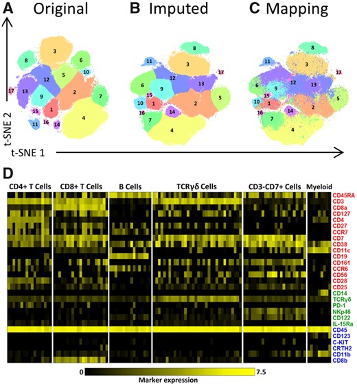
Clustering of the original and the imputed datasets. (A–C) t-SNE maps showing the different identified populations in the CD4+T Cells lineage. (A) Shows the populations of the original data. (B) The populations of the imputed data (for m = 16, L1 = 6 and L2 = 6). (C) The mapping of the original clusters labels on the t-SNE map of the imputed data. (D) Heatmap of markers expression for the 121 characterized immune cells populations of the original dataset for m = 16. Black-to-yellow scale shows the median arcsinh-5 transformed values for the markers expression. Markers colors indicate whether a marker is shared between panels or unique to a single panel, during panels combination (red is shared, green is unique to panel A, blue is unique to panel B)
The clusters from the imputed dataset were correctly matched to the baseline clusters for all 121 cell populations across the six lineages, including large clusters as well as small rare clusters, such as: population 16 and 17 in the CD4+T Cells (Fig. 3A and B), population 21 in the CD8+T Cells, population 16 in the B Cells, populations 3 and 34 in the TCRγδ Cells and populations 23 and 24 in the CD3-CD7+Cells (Supplementary Fig. S16A and B). The imputed expression profiles of the 121 populations are remarkably similar (average correlation of 0.998) to the expression profiles of the corresponding baseline clusters (Supplementary Fig. S17A and Fig. 3D, respectively). Also, the Jaccard index showed a clear diagonal between the original and the imputed clusters (Supplementary Fig. S18).
To gain more insight into the distribution of the original cluster labels in the imputed space, we colored each cell in the imputed data according to baseline cluster they belonged to. Figure 3C and Supplementary Fig. S16C show that the imputed measurements for each cell are indeed faithfully reconstructed, i.e. after mapping them they are distributed similarly as in the original data.
More quantitatively, the imputation had an overall adjusted Rand-index of 0.81 for all the 121 cell populations. Per individual lineage, the adjusted Rand-index varied between 0.77 and 0.83 for the different lineages (Table 3). Since we rely on Gaussian Mean Shift clustering in the t-SNE space, part of the error in clustering the imputed data is caused by the stochastic nature of the t-SNE algorithm (due to random initializations). The clustering reproducibility between two t-SNE mappings of the original data (Table 3, Supplementary Fig. S19) varied between 0.82 and 0.96, with variance estimates (when repeating the procedure 10 times) in the order of 8e–5 (Table 3, for Myeloid and TCRγδ cells). Hence, the quality of the imputed clustering is close to the quality of repeated t-SNE mappings, with a difference of 0.06 in the adjusted Rand-index for all cells.
Adjusted Rand-index of the imputed data at m = 16 and for repeated t-SNE mappings of the original data
| Imputed data | t-SNE rerun | |
|---|---|---|
| CD4+T cells | 0.78 | 0.86 |
| CD8+T cells | 0.79 | 0.84 |
| B cells | 0.83 | 0.85 |
| CD3–CD7+cells | 0.78 | 0.82 |
| TCRγδ cells | 0.77±8e−5 | 0.89±1e−4 |
| Myeloid cells | 0.82±7e−5 | 0.96±6e−5 |
| All cells | 0.81 | 0.87 |
| Imputed data | t-SNE rerun | |
|---|---|---|
| CD4+T cells | 0.78 | 0.86 |
| CD8+T cells | 0.79 | 0.84 |
| B cells | 0.83 | 0.85 |
| CD3–CD7+cells | 0.78 | 0.82 |
| TCRγδ cells | 0.77±8e−5 | 0.89±1e−4 |
| Myeloid cells | 0.82±7e−5 | 0.96±6e−5 |
| All cells | 0.81 | 0.87 |
To further evaluate the effects of imputation on downstream analysis, we compared the population frequencies of the 121 cell populations, estimated using both the original and the imputed datasets. The result shows that population frequencies are accurately estimated from the imputed data as compared to the original data, with an overall correlation of 0.985 (Supplementary Fig. S17B).
3.4 Imputation improves the differentiation of cell populations
We have shown that from the imputed data similar clusters of cells can be found as when using the original data. But, can we find clusters from the imputed data that we cannot find in the two separate panels? Hereto, we overlaid the original cluster labels of the HMIS TCRγδ lineage populations onto t-SNE maps constructed using: (i) only the 22 measured markers of a panel (16 shared+6 unique markers), (ii) the original 28 measured markers and (iii) the imputed dataset (16 shared+6 unique+6 imputed). This was done for both panels A and B separately (Figs 4 and 5, respectively).
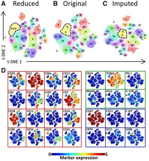
Marker panel extension impact on the identification of distinct populations in the TCRγδ immune lineage—panel A. (A) The Reduced t-SNE map using only 22 markers. (B) The original t-SNE map using the original 28 markers. (C) The imputed t-SNE map using 28 markers of which 6 are imputed from panel B. All three maps are colored with the original population labels. (D) Shared and missing markers expression profiles are shown on the original t-SNE map. The map border color indicate whether a marker is shared between panels or unique to a single panel (red is shared, green is unique to panel A, blue is unique to panel B and thus missing markers for panel A).The color bar shows the arcsinh-5 transformed values for the markers expression
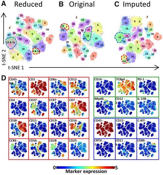
Marker panel extension impact on the identification of distinct populations in the TCRγδ immune lineage—panel B. (A) The Reduced t-SNE map using only 22 markers. (B) The original t-SNE map using the original 28 markers values. (C) The imputed t-SNE map using 28 markers of which 6 are imputed from panel A. All three maps are colored with the original populations labels. (D) Shared and missing markers expression profiles are shown on the original t-SNE map. The map border color indicate whether a marker is shared between panels or unique to a single panel (red is shared, green is unique to panel A and thus missing markers for panel B, blue is unique to panel B).The color bar shows the arcsinh-5 transformed values for the markers expression
For panel A, populations 6 and 8 are merged in one cluster when we map the data using only the 22 panel markers (Fig. 4A), whereas the original and imputed data separate those two clusters (Fig. 4B and C, respectively). To better understand this behavior, we overlaid the expression of the markers across the t-SNE map (Fig. 4D). CD8b has higher expression (mean±std =3.205 ± 0.797) for cells in cluster 6 as compared to cluster 8 (0.584 ± 0.663) and is missing in panel A, hence resulting in not being able to separate clusters 6 and 8. For the imputed data, the missing marker for panel A is imputed by its measurements on panel B, with which both clusters can indeed be separated (Fig. 4C).
Likewise, for the data from panel B, clusters 12 and 31 are merged in one cluster (Fig. 5A), because NKp46 is missing on panel B (Fig. 5D) with cells having a higher expression in cluster 31 (2.728 ± 0.712) compared to 12 (0.505 ± 0.586). Also, clusters 7 and 14 are merged due to the lack of the TCRγδ marker (Fig. 5D). For both situations, the clusters are separated when the data from panel B is imputed with data from panel A (Fig. 5C).
Similar observations can be made for the other lineages (Supplementary Figs S20–S24). For example, for both the CD8+T (Supplementary Fig. S20) and Myeloid (Supplementary Fig. S21) lineages, the CRTH2 marker makes a difference between clusters based on one panel-only data compared to data from combined panels. For some lineages, the clustering based on individual panels does, however, closely match the clustering on the original data. Either the missing markers are not important (e.g. CD11b in panel A of the CD8+T cells, Supplementary Fig. S20), or they are important but highly correlated with one of the shared markers (e.g. CD14 in panel B of the Myeloid cells, Supplementary Fig. S21, has a similar expression to CD38).
To quantitatively assess the ability to differentiate between cell populations based on different sets of markers, we tested the ability of a two-class Linear Discriminant Analysis classifier (Abdelaal et al., 2019), to differentiate between populations 6 and 8 in the TCRγδ cells. We evaluated Linear Discriminant Analysis’ performance using only the 16 shared markers, all 28 markers from the TCRγδ imputed data and all 28 markers from the TCRγδ original data. We obtained the highest performance using all markers from the original data, with an accuracy of 95.74 ± 0.70%. The lowest performance was obtained when using only the 16 shared markers (accuracy= 70.37 ± 1.07%). Using all markers from the imputed data resulted in an accuracy of 83.46 ± 1.13%, which is less than the original data, as expected, but showing a strong improvement over the shared markers. This confirms our previous conclusion that the imputation improves over the shared markers, despite the fact that the imputation relies on the shared markers. We obtained similar results for populations 12 and 31, and populations 7 and 14 (Supplementary Fig. S25).
4 Discussion
We demonstrated the feasibility of combining data from different CyTOF panels with a set of shared markers in common. We showed that by imputing data, the heterogeneity of the data can be better captured than with the individual panels separately. Also, we presented a data-driven approach to select the set of shared markers that are most informative to be used to align panels.
The selected set of shared markers can capture the underlying structure of the data. For example, from the HMIS dataset we saw that for small values of m, the selected shared markers include CD3, CD4 and CD8a which separate the main CD4+ and CD8+T cells immune lineages from the rest of the cell populations. As m increases, the selection algorithm starts to include markers that differentiate the different populations within a single lineage. Our selection approach relies on the variation in expression across cells. As a result, CD45, an essential marker which is positively expressed across all immune cells, is never selected due to its low variance.
To assess the quality of imputation, we relied on three scores that capture the cluster and neighborhood concordance between the imputed and original data. For the HMIS dataset, we observed prominent discordance when a low number of shared markers is used (m < 12), mainly due to exclusion of key lineage specific markers within the set of shared markers resulting in imputation failures. The number of shared markers to properly align panels does depend heavily on the complexity and heterogeneity of the data. For the HMIS dataset, studying PBMCs and tissue samples from patients with three different inflammatory bowel diseases as well as controls, 16 shared markers were needed. Whereas for the Vortex dataset, that replicated mouse bone marrow samples, 11 markers were sufficient. On the other hand, we saw that for both datasets we can capture and reconstruct all cell clusters, despite their number and sizes, suggesting that the imputation is not biased toward the clustering. Although the performances do differ for different settings of the number of shared markers (m) and number of neighbors used during imputation (k), they are not sensitive to the exact setting, illustrating the robustness of CyTOFmerge.
Note that during the shared maker selection procedure we represented highly correlated markers by only one representative marker. We made this choice because highly correlated markers will get the same importance by the PCA selection scheme, and thus might be selected together. Selecting a highly correlated marker as an additional shared marker will, however, not add any information to the shared makers, while, at the same time, occupying a marker slot in the panel. To reduce this redundancy and free as many slots as possible on the panel we made the choice to represent highly correlate makers with only one marker. Clearly, the choice for the threshold plays an important role as when the correlation is lower the markers will also add more distinct information.
We have shown that by imputing more markers, it is possible to better differentiate between cell populations, but on the other hand, the imputation of markers does affect the quality of the downstream analysis when compared to non-imputed data. We saw that clustering of the imputed data is not perfectly similar to the original data (adjusted Rand-index <1). Indeed, this is affected by the homogeneity of the dataset, as we saw higher performance for the Vortex datasets compared to HMIS (Vortex being more homogenous). Generally, the number of shared markers will affect the downstream analysis, i.e. increasing the number of shared markers will increase the quality of the imputation, and the downstream analysis will more faithfully resemble analyses done on non-imputed data. But that will also restrict the number of unique marker slots available on each panel. Using less shared markers will increase the number of unique markers, which in turn will increase the capacity to capture more heterogeneity, but at the expense of imputation quality. This trade-off is being influenced by the local structure (homogeneity) in the data, which is, unfortunately, hard (or even impossible) to predict beforehand, in general.
Compared to FC methods, CyTOFmerge outperformed the first-nearest-neighbor method, and achieved comparable performance with the cluster-based imputation. The later shows that the pre-clustering step of the shared markers is unnecessary, as the imputation through the entire data using CyTOFmerge produces similar results. Further, we demonstrated that by imputing more markers, we obtained better differentiation between different cell populations. However, the imputation depends on how similar cells are in the shared markers space, indicating that the variation between populations that can only be differentiated based on imputed (non-shared) markers is to some extent retained in the shared markers.
To practically apply CyTOFmerge, we recommend the following steps: (i) collect the samples and divide them in two parts. (ii) Design the first marker panel according to the biological question one wants to be answered. The marker panel would probably contain lineage markers, to differentiate between the major cell types, and cell state markers, for more detailed subtyping, and intracellular markers of interest (Bendall et al., 2011). (iii) Stain the first part of the samples with the designed marker panel and measure the samples with CyTOF. (4) Apply the marker selection pipeline on the measured dataset using the first panel and obtain the most informative markers (i.e. shared markers). (5) Include those shared markers while designing the second panel of marker. (6) Add extra state or intracellular markers of interest to the second panel. (7) Stain the second part of the samples with the second marker panel and measure the samples with CyTOF. (8) Apply the imputation algorithm to all samples, combining both datasets from both panels, and create the imputed dataset in which each cell is represented by the unique markers from each panel (one of which is imputed), as well as the shared markers.
Importantly, we have shown that by combining panels a richer protein profile of cells can be acquired with which it becomes possible to find both abundant as well as rare cell populations. This opens possibilities to merge even more panels based on a common shared marker set as there is no fundamental limit to restrict to the combination of two panels.
Funding
This work was supported from the European Commission of a H2020 MSCA award under proposal number [675743] (ISPIC).
Conflict of Interest: none declared.
References

