


Abstract
The increasing number of single cell and bulk RNAseq datasets describing complex gene expression profiles in different organisms, organs or cell types calls for an intuitive tool allowing rapid comparative analysis. Here, we present Swift Profiling Of Transcriptomes (SPOT) as a web tool that allows not only differential expression analysis but also fast ranking of genes fitting transcription profiles of interest. Based on a heuristic approach the spot algorithm ranks the genes according to their proximity to the user-defined gene expression profile of interest. The best hits are visualized as a table, bar chart or dot plot and can be exported as an Excel file. While the tool is generally applicable, we tested it on RNAseq data from malaria parasites that undergo multiple stage transformations during their complex life cycle as well as on data from multiple human organs during development and cell lines infected by SARS-CoV-2. SPOT should enable non-bioinformaticians to easily analyse their own and any available dataset.
SPOT is freely available for (academic) use at: https://frischknechtlab.shinyapps.io/SPOT/ and https://github.com/EliasFarr/SPOT.
Supplementary data are available at Bioinformatics online.
1 Introduction
To understand cell and organ-specific functionality, gene expression patterns are often determined as a first step before specific genes are investigated in more detail. Many researchers are interested to identify genes that are specifically expressed in certain entities such as cell types, developmental stages, tissues or species where their encoded proteins can play diverse or similar roles. Different tools exist to visualize profiles of known genes or to perform differential expression analysis (DEA) (Ge et al., 2018; Papatheodorou et al., 2020; Reyes et al., 2019). However, there is no intuitive tool to extract and visualize gene expression patterns matching user-defined gene expression profiles of interest, POI (Fig. 1A). Swift profiling of transcriptomes (SPOT) addresses this need (Fig. 1B and C): sliders on the application’s control panel allow users to enter their own POI across the desired entities of a dataset. This slider-entity connection is the basis for a ranking process that is updated every time a slider is moved. The results of the spot ranking algorithm are visualized in the main panel as table, bar chart or dot plot (Fig. 1C). For the proof-of-concept, we pre-installed data in SPOT from studies on organ development of Homo sapiens (bulkRNAseq) (Cardoso-Moreira et al., 2019) and developmental stages of the rodent infecting malaria parasite Plasmodium berghei (scRNAseq) (Howick et al., 2019) as well as a SARS-CoV-2 infected human cell line (Wyler et al., 2021). The general workflow and the interface design can be seen in Figure 1, while example predictions and comparison with state-of-the-art methods are available in the Supplementary Material.
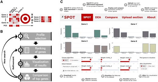
(A) Logic and (B) workflow of SPOT. (C) Cartoon version of the SPOT web interface highlighting specific functions
2 Materials and methods
SPOT is a web-based R shiny app, which mainly consists of a visualization and a control panel. While the user can make selections in widgets such as tables, sliders, drop-down menus or buttons in the control panel, the visualization panel depicts the results of the given input.
For each analysis variant, the app has a section with its own functionalities in the lower panel and visualization methods in the upper panel.
2.1 Spot expression profile
In this proof-of-concept version of SPOT expression profiles from the three implemented sets of data can be extracted. To this end, the POI of each entity (e.g. cell type, stage of development, organ and infected versus non-infected cell) can be defined via a slider with values from 0 to 2. These slider values serve as weights for the spot algorithm, which is mainly based on the calculation of a weighted sum (Supplementary Section S1.2). Therefore, spot ranks the genes according to the match of their expression to the POI as reflected by the slider constellation. The top ranked genes can be displayed as table, bar chart or dot plot. In case of a single cell dataset, the dot plot visualizes the proportion of cells in which gene expression is detected as dot circumference—and the average expression as dot color. For bulk RNAseq data, gene expression is visualized as circumference of a dot. For further analysis, the results can be downloaded as Excel file. Also links to the database entries of the individual genes are provided. A detailed definition of the spot algorithm is available in the Supplementary Material.
2.2 DEA
For users interested in a more precise but less interactive candidate search, we have also implemented a DEA tool based on Seurat, MAST and DESeq2 (Finak et al., 2015; Hao et al., 2020; Love et al., 2014). Similar to SPOT, the user can select the POI of entities in the lower panel. Due to its simplicity a Wilcoxon rank sum test between the selected and unselected entities is performed as default. As more time-consuming methods MAST (for single cells) and DESeq2 are available for ranking (Supplementary Fig. S1). For visualization, the same charts are available as for the SPOT section.
2.3 Comparing profiles
Gene expression values of three pre-installed datasets are listed as an HTML table in the lower panel enabling the selection of single genes for visualization. The table can be searched with a term, filtered by multiple attributes (e.g. name and expression values) or subdivided by expression value ranges. Each selected gene is displayed as an interactive bar chart in the visualization panel, which allows quick profile comparisons e.g. of already known genes with the results of the performed analysis.
2.4 Analysis of additional datasets
To allow users to examine their own records or published datasets, data files (.csv/.xlsx) can be readily uploaded. The shiny app then creates a slider for each column name. Uploaded datasets are visualized in the same way as described under Sections 2.1–2.3. Note that SPOT has been created for normalized and raw single cell—as well as normalized bulk RNA sequencing datasets. For raw bulk RNA sequencing sets, please use the tools mentioned in the Section 1.
3 Conclusion
SPOT provides an easy-to-use web tool for ranking genes with an expression profile that matches user-defined characteristics. Moreover, it allows swift visual comparison of multiple genes as well as DEA of datasets.
Funding
This work was supported by the grant from the German Centre for Infection Research, TTU Malaria, project number TTU 03.813.
Conflict of Interest: none declared.

