Figure 1:
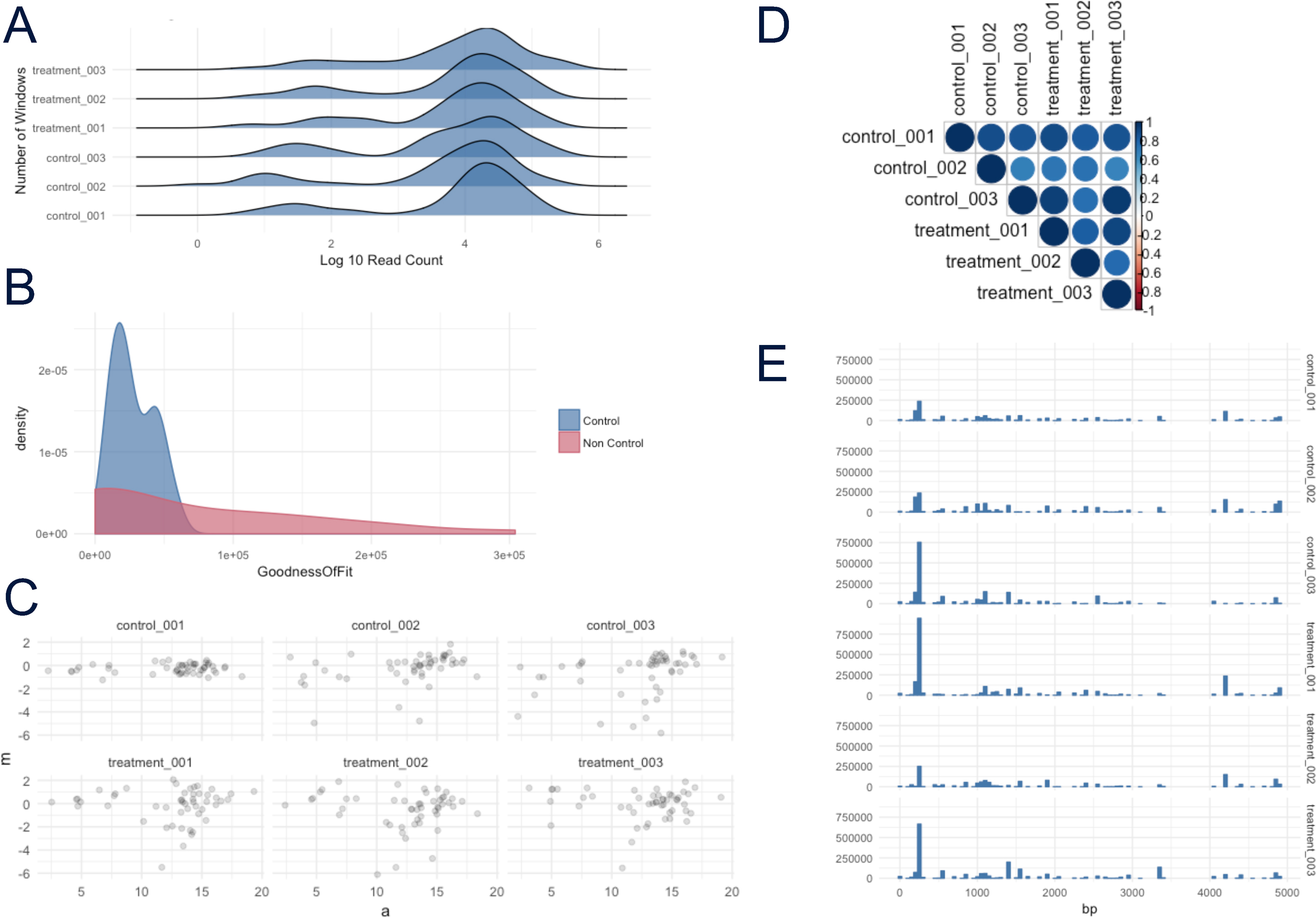
Example plots from atacR, generated on simulated data. (A) Per sample coverage count density. (B) GoF estimate density plot for control/noncontrol windows. (C) Per sample plot of log ratio versus average intensity (MA) plot. (D) Per sample similarity heat map. (E) Per sample chromosome coverage count histogram.